Overall I must say that my experiences in MediaP 150 have been, for the most part, educational, informative, and entertaining. The lab and lecture layout of the class has helped me to both understand film and media through the hands on and what I found to be real life experiences as well as the lectures, which gave me more explanation of the different aspects of what we were learning.
I would say that the only negative that I found that the class presented was the lack of time for each of the lab demos or projects. I think that if there were more than one film camera demo, more than one HTML demo, and more than one Photoshop demo the students would be able to retain more of the information. I thought that there was too much information crammed into a short amount of time.
Some things that I learned from the semester that will always stand out were the still and moving image composition rules and shots we went over near the first few weeks of the semester. Those ideas and rules were new to me and I found it very insightful and helpful to be able to try these techniques and rules out with the hands on projects.
Monday, May 24, 2010
Thursday, May 13, 2010
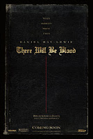
Design I Like: There Will Be Blood Poster

One functional media design that struck me was a movie poster, probably used as a subway advertisement, for Paul Thomas Anderson’s film There Will Be Blood. The movie happens to be one of my favorite films and I think that the poster not only attracts an audience member like myself but also shares with the observer of the poster a bit of what the style of the movie is.
While the poster may lack an over the top graphic or even appear a bit dull there is a great deal of detail and expression in the limited text and graphic displayed. When examining the composition and balance of the poster it is striking how the text on the poser is both centered horizontally and positioned in size order vertically from top to bottom, with the bottom “COMING SOON” as an exception, maybe to draw attention to an approximate release date. The first phrase, ranging 3 lines, reads “WHEN AMBITION MEETS FAITH” sharing with the audience a theme of the movie with a simple sentence. The next line reads “DANIEL DAY-LEWIS” shown in a font a bit larger, which strikes the eye and grabs the attention from the first to the next line. Directly under Daniel Day-Lewis’ name is the title of the film There Will Be Blood, presented in again a much larger font but this time the font style is different. The Title is written in an Olde English style, like a font that you might find on an old book or bible. The style again relates the bible type look to the theme of the movie, which is a conflict between the rewards of the church and the rewards of capitalism.
After the Title the poster shifts downward with a striking but thin red line moving down the horizontal center of the poser to the smallest text reading, “Written for the Screen and Directed by/ PAUL THOMAS ANDERSON” giving credit where credit is obviously due to, the mind behind the wonderful film. The final color or background that the text positions itself on is an old black book cover with a worn and tattered binding, proving an overarching backdrop of religion and an historic or antique mood.
Subscribe to:
Comments (Atom)